
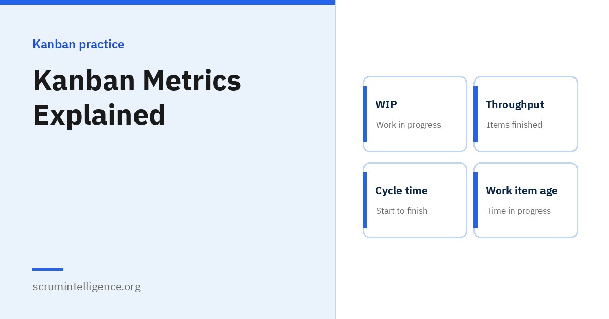
Kanban teams do not guess how their work is going; they measure it. A small set of flow metrics tells a team how much work is in progress, how quickly it finishes, how long each item takes and which items are at risk. These metrics support better conversations, more realistic forecasts and steady improvement. This guide explains the four core Kanban metrics, how to collect them, the charts that make them useful and how to forecast with them, with a worked example.
Key takeaways
- The Kanban Guide names four key flow measures: work in progress, throughput, work item age and cycle time.
- You only need two dates per item, when it started and when it finished, to calculate all four.
- Little's Law links WIP, throughput and cycle time, and explains why limiting WIP speeds up delivery.
- Percentiles from a cycle time scatterplot give realistic expectations, such as "85% of items finish within 8 days".
- Monte Carlo forecasting uses past throughput to answer "when will it be done?" with a probability.
Why measure flow?
Metrics are not the goal of Kanban. They are tools that help a team:
- See reality: how the system actually performs, not how people feel it performs.
- Spot problems early: ageing items and growing queues are visible before they become late deliveries.
- Improve with evidence: the effect of a change, such as a lower WIP limit, can be measured.
- Set expectations: customers get forecasts based on data rather than optimism.
For the ideas behind Kanban, see our complete Kanban guide.
The four core flow measures
The Kanban Guide by Daniel Vacanti and Yuval Yeret identifies four key flow measures:
| Measure | Definition | Question it answers |
|---|---|---|
| Work in progress (WIP) | The number of work items started but not finished | How much are we carrying right now? |
| Throughput | The number of work items finished per unit of time | How much do we deliver each week? |
| Work item age | The time between when a work item started and now, for items still in progress | Which items are at risk of taking too long? |
| Cycle time | The time between when a work item started and when it finished | How long does an item usually take? |
Work in progress
WIP is a count of items between the point where the team commits to them and the point where they are finished. It is the one measure the team controls directly, through WIP limits. See WIP limits explained.
Throughput
Throughput counts finished items per period, usually per day or week. It says nothing about item size, but over time it is a surprisingly reliable basis for forecasting, because item sizes tend to even out.
Work item age
Work item age applies only to unfinished work. It is the most useful measure for day-to-day management, because it shows which items need attention now, before they become late.
Cycle time
Cycle time applies to finished work. Looking at the spread of cycle times, not just the average, tells a team how predictable it is.
Lead time vs cycle time
These terms are used differently in different sources, which causes confusion. In the Kanban Guide, cycle time runs from when an item starts to when it finishes. In the Kanban Method, lead time is commonly used for the time from the commitment point to the delivery point, and customer lead time for the time from the customer's request to delivery. Some teams use lead time for the whole journey from request to delivery and cycle time for the active part only. The most important thing is to agree your own definitions, write them down and use them consistently.
How to collect the data
You need very little data:
- Agree the start point: usually when an item crosses the commitment point.
- Agree the finish point: usually when an item is delivered or reaches Done.
- Record both dates for every item. Most digital tools do this automatically; with a physical board, a simple spreadsheet works.
A common convention, used by Daniel Vacanti among others, is to count cycle time in calendar days and include both the start and finish days, so an item started and finished on the same day has a cycle time of one day. Whatever convention you choose, apply it consistently.
Little's Law
Little's Law, published by John Little in 1961, links three of the measures:
Average cycle time = average WIP ÷ average throughput
For example, a team with an average of 12 items in progress that finishes an average of 4 items a week has an average cycle time of about 3 weeks. Reduce WIP to 8 while throughput stays at 4, and average cycle time falls to about 2 weeks.
Little's Law describes averages over a period and relies on assumptions, including that the system is reasonably stable, that work arriving roughly matches work leaving and that started work eventually finishes. It is best used to understand the relationship between the measures, not to predict individual items.
Charts that make the metrics useful
Cumulative flow diagram (CFD)
A CFD shows, for each day, how many items have reached each stage of the workflow, as stacked coloured bands. How to read it:
- The vertical distance between the top of the "started" band and the "finished" line shows WIP.
- The horizontal distance between them gives an approximate sense of how long items take.
- Bands that widen over time show a growing queue at that stage, often a bottleneck.
- Flat lines show that nothing is moving.
Cycle time scatterplot
Each finished item is a dot: its finish date on the horizontal axis and its cycle time on the vertical axis. Lines at the 50th, 85th and 95th percentiles show, for example, that half of items finish within 4 days and 85% within 9 days. Scatterplots reveal outliers, which are often worth investigating.
Ageing work in progress chart
This chart shows each unfinished item in its current column, positioned by its age. Percentile lines from past cycle times show which items are older than usual for their stage and need attention. Many teams find this the most useful chart for daily meetings.
Throughput run chart
A simple chart of items finished per week. It shows whether delivery is steady, improving or dropping, and provides the data for forecasting.
Cycle time histogram
A bar chart showing how many items took one day, two days, three days and so on. Its shape shows whether most items finish quickly with a long tail of slow ones, which is common in knowledge work.
Service Level Expectations
The Kanban Guide describes a Service Level Expectation (SLE) as a forecast of how long a single work item should take to finish, with a probability. Teams usually base it on a percentile from their cycle time data, for example "85% of items finish within 9 days". An SLE helps customers know what to expect and helps the team act early: when an item's age approaches the SLE, it gets extra attention.
Forecasting with Monte Carlo simulation
Instead of estimating every item, many Kanban teams forecast using their past throughput. Monte Carlo simulation works like this:
- Take the team's recent daily or weekly throughput, for example the last 10 to 20 weeks.
- Randomly sample from those past values to simulate how many items might be finished each week in the future.
- Repeat the simulation thousands of times.
- Look at the spread of results.
This answers two common questions with a probability:
- "When will these 30 items be done?" For example, an 85% chance by a certain date.
- "How many items can we finish by this date?" For example, an 85% chance of at least 18 items.
Forecasts should be updated regularly as new data arrives. They are only as good as the stability of the process behind them.
A worked example
As an illustration, imagine a team finished these ten items over two weeks, with cycle times counted in days:
| Item | Cycle time (days) |
|---|---|
| A | 2 |
| B | 3 |
| C | 3 |
| D | 4 |
| E | 4 |
| F | 5 |
| G | 6 |
| H | 7 |
| I | 9 |
| J | 15 |
From this small sample:
- Throughput is 10 items in 2 weeks, or 5 per week.
- Half the items finished within 4 days, and 9 of the 10 finished within 9 days.
- The average is 5.8 days, but it is pulled up by item J. Percentiles describe the typical experience better than the average.
- Item J is an outlier worth discussing: was it blocked, too large or waiting for someone?
With only ten items, these numbers are a starting point. As more items finish, the picture becomes more reliable.
Using metrics well
- Use them for learning, not judgement. Flow metrics describe the system, not individual performance.
- Look at trends and spreads. A single week's numbers can mislead.
- Discuss them together. Review key charts in regular meetings and ask what they suggest.
- Change one thing at a time. Then watch the metrics to see its effect.
What to put on a metrics dashboard
A simple, focused dashboard is more useful than dozens of charts. Many teams start with four views:
- Ageing work in progress: for daily attention to at-risk items.
- Cycle time scatterplot with percentiles: for expectations and outliers.
- Throughput per week: for trends and forecasting.
- Cumulative flow diagram: for spotting growing queues and bottlenecks.
Keep the definitions of start and finish visible next to the charts, so everyone reads them the same way.
Reading a cumulative flow diagram: common patterns
- A band that keeps widening: work is arriving at that stage faster than it leaves. This often points to a bottleneck.
- A flat "finished" line: nothing is being delivered. Check for blocked work or a stage that has stopped.
- Stair steps: work moves in large batches rather than flowing, for example when items are released together once a month.
- A flat top line: no new work is being started, which may be deliberate while the team finishes existing work.
- Parallel, steady bands: a stable system where arrivals and departures are balanced.
Probabilistic versus deterministic forecasting
Traditional forecasting estimates each item and adds the estimates to produce a single date. This is deterministic: it gives one answer, which is usually treated as a promise. In complex work, individual estimates are often wrong, and errors add up.
Probabilistic forecasting, such as Monte Carlo simulation, instead gives a range of outcomes with probabilities, based on how the team has actually performed. "There is an 85% chance we finish by 14 March" is more honest than "we will finish on 1 March", and it helps stakeholders make better decisions about risk. It also saves time, because the team does not need to estimate every item in detail.
Using metrics in meetings
- Daily meeting: look at the ageing work in progress chart and focus on the oldest items and any blocked work.
- Replenishment: check current WIP before pulling in new work.
- Service delivery review: review cycle time percentiles against the Service Level Expectation and discuss outliers.
- Retrospective or improvement review: look at trends in throughput and cycle time after a change, and decide what to try next.
Sharing metrics with stakeholders
Stakeholders usually care about two questions: when will my item be done, and can I rely on your forecasts? Flow metrics answer both. Share your Service Level Expectation so they know how long a typical item takes, and use probabilistic forecasts for larger pieces of work. Explaining the difference between a forecast and a promise builds trust over time, especially when the team's forecasts prove reliable.
Starting when you have no data
Many teams hesitate to use flow metrics because they have no history. You do not need much to begin:
- Agree your start and finish points today.
- Record both dates for every item from now on.
- After two or three weeks, look at work in progress and throughput.
- After around ten to twenty finished items, cycle time percentiles start to become meaningful.
- After a couple of months, throughput data is usually enough for a first Monte Carlo forecast.
Early numbers will be rough. That is fine; the habit of recording data is what matters, and the picture sharpens with every item.
Percentiles in plain language
Percentiles can sound technical, but the idea is simple. If the 85th percentile of your cycle time is 9 days, it means that 85 out of every 100 recent items finished in 9 days or less. The 50th percentile, also called the median, is the point where half finished faster and half slower.
Teams prefer percentiles to averages for two reasons. First, knowledge work usually has a few very slow items that pull the average up and make it misleading. Second, percentiles translate directly into useful statements for customers, such as "most requests are done within a week, and almost all within two".
Common mistakes with metrics
- Turning metrics into targets. Goodhart's Law, named after economist Charles Goodhart, is often summarised as "when a measure becomes a target, it ceases to be a good measure". Targets encourage gaming, such as splitting items artificially to raise throughput.
- Comparing teams. Different teams have different work; comparing their numbers rarely helps.
- Relying on averages alone. Averages hide the long tail of slow items that customers remember.
- Measuring without acting. Charts that nobody discusses change nothing.
- Inconsistent definitions. If start and finish points change, the data stops being comparable.
Flow metrics in Scrum Teams
Many Scrum Teams track velocity, the amount of estimated work completed per Sprint. Flow metrics offer a complementary view: throughput counts finished items without estimates, and cycle time shows how long items take within the Sprint. The Scrum Guide notes that practices such as burn-down and burn-up charts and cumulative flows can be useful for forecasting, but do not replace the importance of empiricism. Our Kanban vs Scrum article compares the two approaches.
Tools
Most digital Kanban tools can record start and finish dates and produce cumulative flow diagrams and cycle time charts, sometimes through add-ons. A spreadsheet is enough to begin: one row per item with its start and finish dates lets you calculate every measure in this guide.
Learn more
For board design and limits, see how to set up a Kanban board and WIP limits explained. If you want to build and demonstrate Kanban skills, Kanban Management in Systems Plus covers flow, WIP limits and flow metrics; the exam is taken online on ExamVault by CertExpert with three attempts included, and the certificate and digital badge are valid for two years.
Frequently asked questions
What are the four Kanban flow metrics?
Work in progress, throughput, work item age and cycle time, as identified in the Kanban Guide.
What is cycle time in Kanban?
The time between when a work item starts and when it finishes.
What is the difference between lead time and cycle time?
Definitions vary. Cycle time usually measures from start to finish of work; lead time often measures from commitment or request to delivery. Agree definitions within your team.
What is throughput?
The number of work items finished in a period, such as per week.
What is work item age?
How long an unfinished item has been in progress. It helps teams spot items at risk.
What is a cumulative flow diagram?
A chart showing how many items have reached each stage over time. Widening bands reveal growing queues.
How does Monte Carlo forecasting work?
It uses past throughput to simulate many possible futures and gives forecasts with probabilities, such as an 85% chance of finishing by a certain date.
Should Kanban metrics be used as targets?
Generally no. Using them as targets encourages gaming; they are most useful for learning and improvement.